Before I get to today’s topic, I just found out that John D. Berry’s ebooks on type and design are free for download:
Dot-Font: Talking about Fonts and Dot-Font: Talking About Design
From here: https://johndberry.com/blog/2011/08/27/free-amusing-book/
They’re collections of his dot-font columns and might be of interest to some of you.
SMART QUOTES AREN’T SMART ENOUGH
You know how it seems like no one can get “its” versus “it’s” right anymore? Well, the typesetter’s version of that is no one can seem to tell the difference between when to use the single open quote versus the single CLOSE quote, also known as the apostrophe.
The single open quote looks like a teensy numeral 6. The close-quote/apostrophe looks like a teensy numeral 9.
Software thinks that the apostrophe goes in the middle of words like didn’t or O’Leary. It thinks that whenever a quote mark (single or double) comes after a space, it should be an OPEN-quote, not a close-quote.
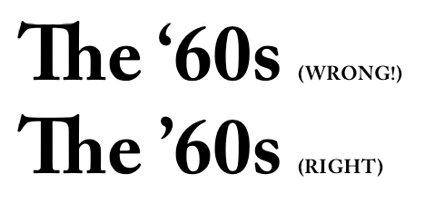
But what happens when a sentence starts with ‘Tis? Or you want to talk about back in the ’70s? Those are apostrophes, too. But “smart quotes” doesn’t know that. So you have to go in and fix them by hand. Common usages I search for include dialogue where characters use ’em for “them”, decades like ’50s, ’60s, anything else that may come up.
In ebooks we’ve often just reverted to “straight” quotes, which are symmetrical right/left open/close and look basically like sesame seeds. (I once had a nightmare I had to type a manuscript on a manual typewriter and the quote key was broken, so I had to glue black sesame seeds onto the page.)
SECTION BREAKS: TO FLEUR OR NOT TO FLEUR
And now let’s talk about section breaks.
These are those gaps in a manuscript where it’s not time for a new chapter yet, but the author indicates a break. In manuscripts these are often indicated with three asterisks.
You could keep those same three asterisks in your typeset, but what might look better is a fleur. Another word for fleur is dingbat. There are whole fonts who are nothing but little squiggles, symbols, pictograms, and such, intended for this purpose.
*** fleurs.jpg
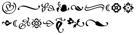
Above are some typical fleurs. These are from the Minion Ornaments font from Adobe.
Should your fleur be centered, or on the left edge? It can be either. What it should NOT be is indented like a regular paragraph.
And of course, you can make the break without any fleurs. You can do it with just a GAP of white space.
Typically when you do that, the first paragraph after the gap is NOT indented. Sort of like how the first paragraph of a chapter or story is also NOT indented (especially when a drop cap is used… see earlier post about that).
In most programs you can even define a style sheet that says okay, my post-break paragraph is non-indented and preceded by three-quarters of an inch of white space. The problem with defining the size of the gap this way is that you want it to work out to equal a certain number of lines. Otherwise you’ll get a text block on your page that is too short compared to its facing page. Imagine your gap is the size of two and a half lines… the result would be at the bottom of the page you end up with a paragraph that is a half line short of the facing page, unless that page has the same number of section breaks in it.
While we’re discussing fleurs, one other place you’ll sometimes see them is next to the page number or in the running head. I’m not fond of that usually, but sometimes it can work. All I can caution here is USE SPARINGLY. If you’re already using a fleur for your section breaks, don’t also use one by the page number, and between the author’s name and the title. You don’t want it to look like confetti on the page.
Tomorrow, final post? (Unless you guys ask more questions I should be answering!) Some stuff specifically about ebooks, including tips about cover design and interiors. (Click here to continue.)